A BRANDED HOUSE DIVIDED
When we first met with the Baldwin Brand, their situation was not uncommon. Over the years, in an effort to expand into other markets and demographics, they split off a number of sub-brands, each with their own unique look and positioning. From their most prestigious line, Baldwin Estate, to their Prestige Line—designed to make Baldwin’s craft, material and signature style affordable to all. Each with their own positioning, each with their own disparate brand essence… and communication. Our goal was to bring them all together, under one full spectrum brand refresh, so that they worked more harmoniously under a more unified Baldwin vision while still maintaining their individuality.
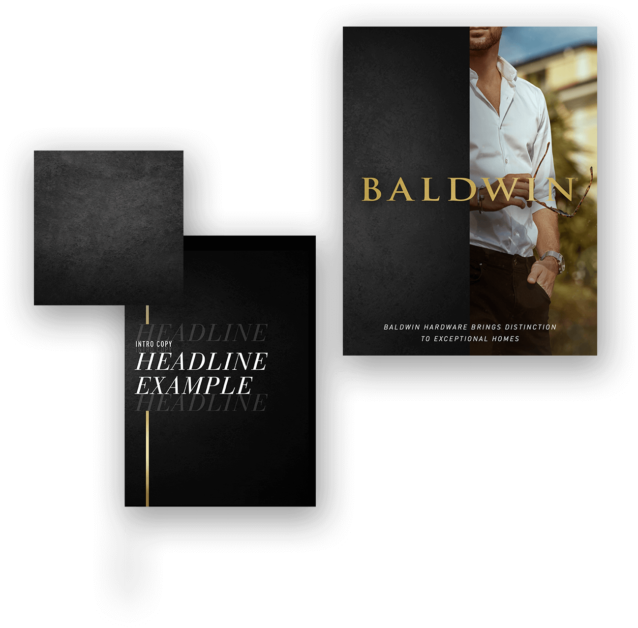
BALDWIN HARDWARE —
A new look for a historic hardware brand
For more than 75 years, Baldwin has been the hardware leader with a reputation for bold design, hand-crafted styling and cutting-edge innovation that can found in some of the finest homes in America. But even the best brands need a refresh after a few decades.
Client
Baldwin Hardware
Project
Repositioning
Deliverables
Brand House and Sub Brand Positioning, Style Guides, Final Art
THE
CHAL
LENGE
REPOSITIONING FOR A UNIFIED VOICE
Our first task was to take all the input we had from the brand and it’s sub-brands, it’s history, and it’s relationship with customers across 4 unique voices, and find a common thread that could unite them. At their core, each of the brands and the master Baldwin brand was about prestige. It was not only about the quality and design of the products – but the cache, the distinction and the essence that the brand provided. In order to ensure that the Baldwin cache transferred to through the repositioning, we created a tiered positioning architecture that united the language and styling of each sub-brand so that they supported each other, and the Branded House across their customer universe.


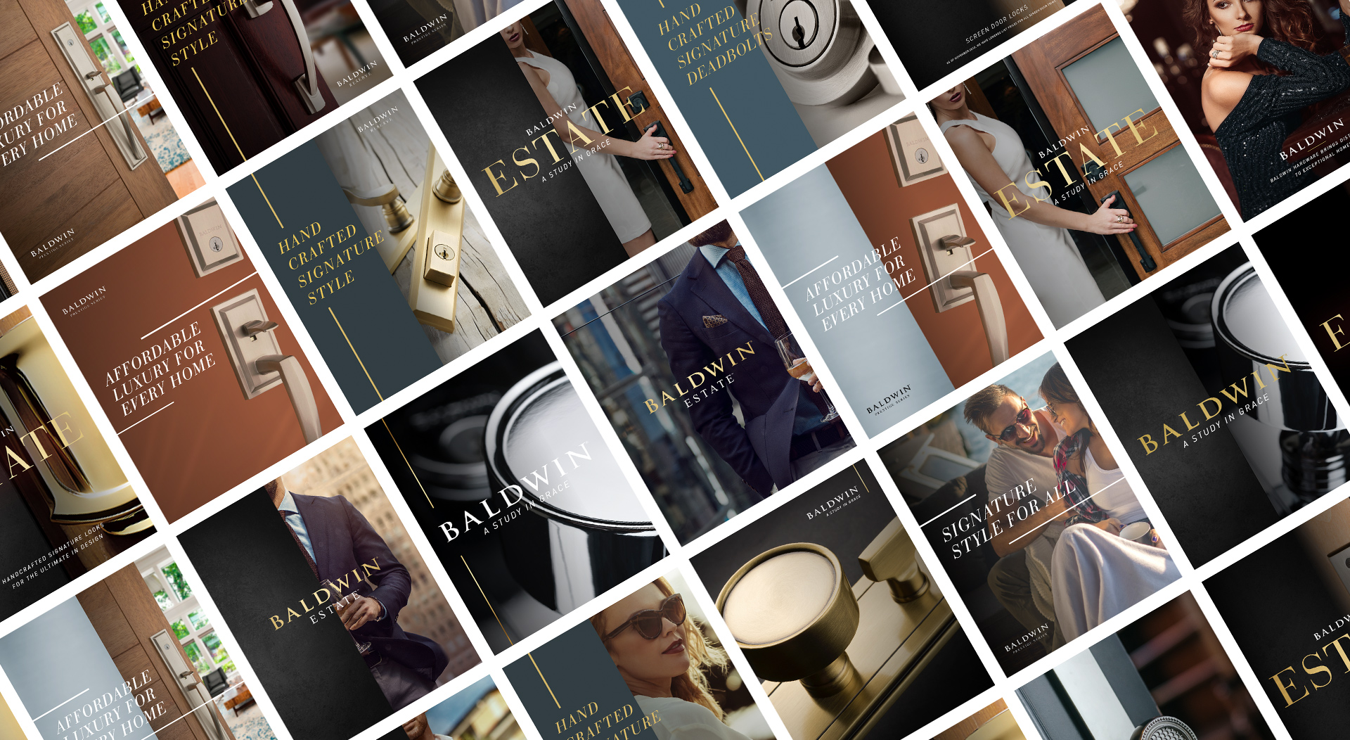
BRANDING TO THE BALDWIN “UNIVERSE”
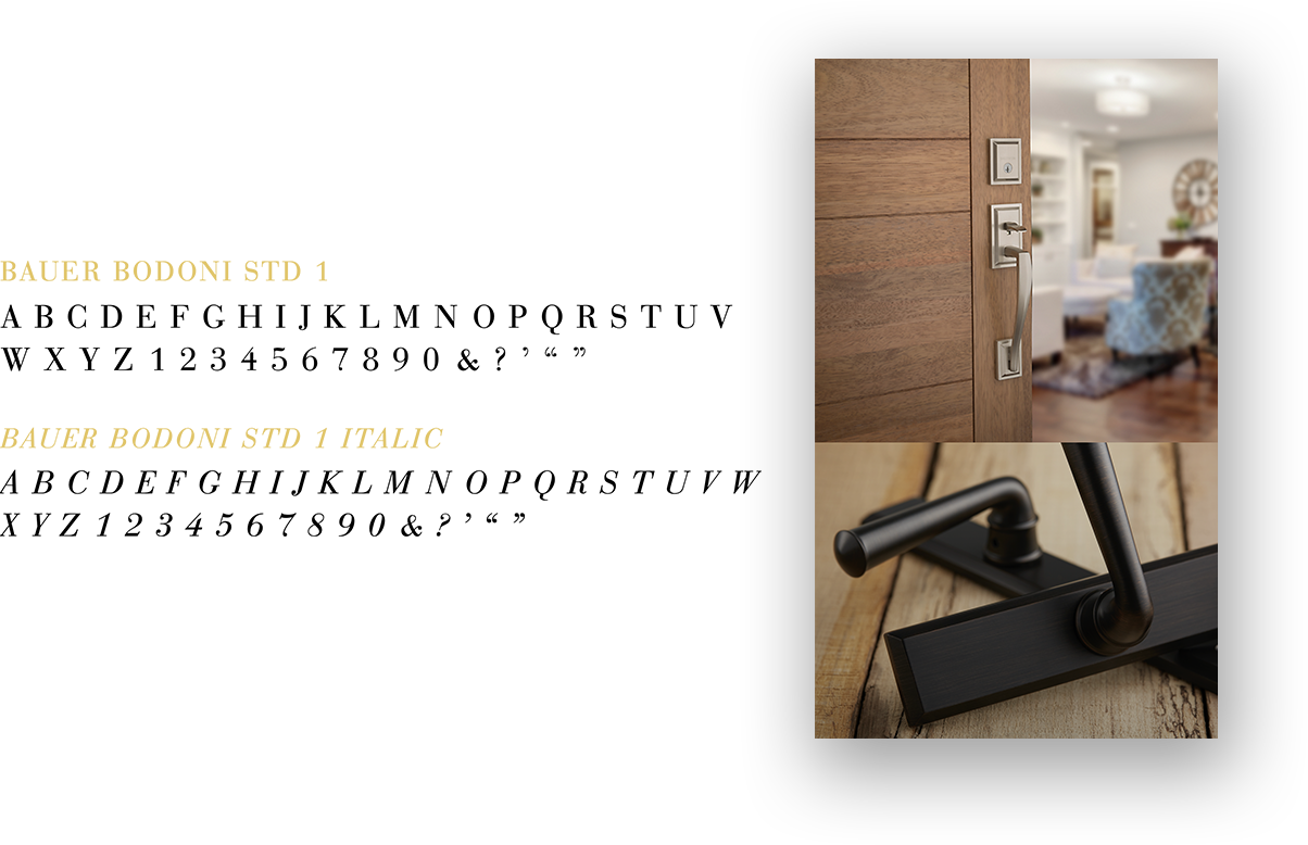
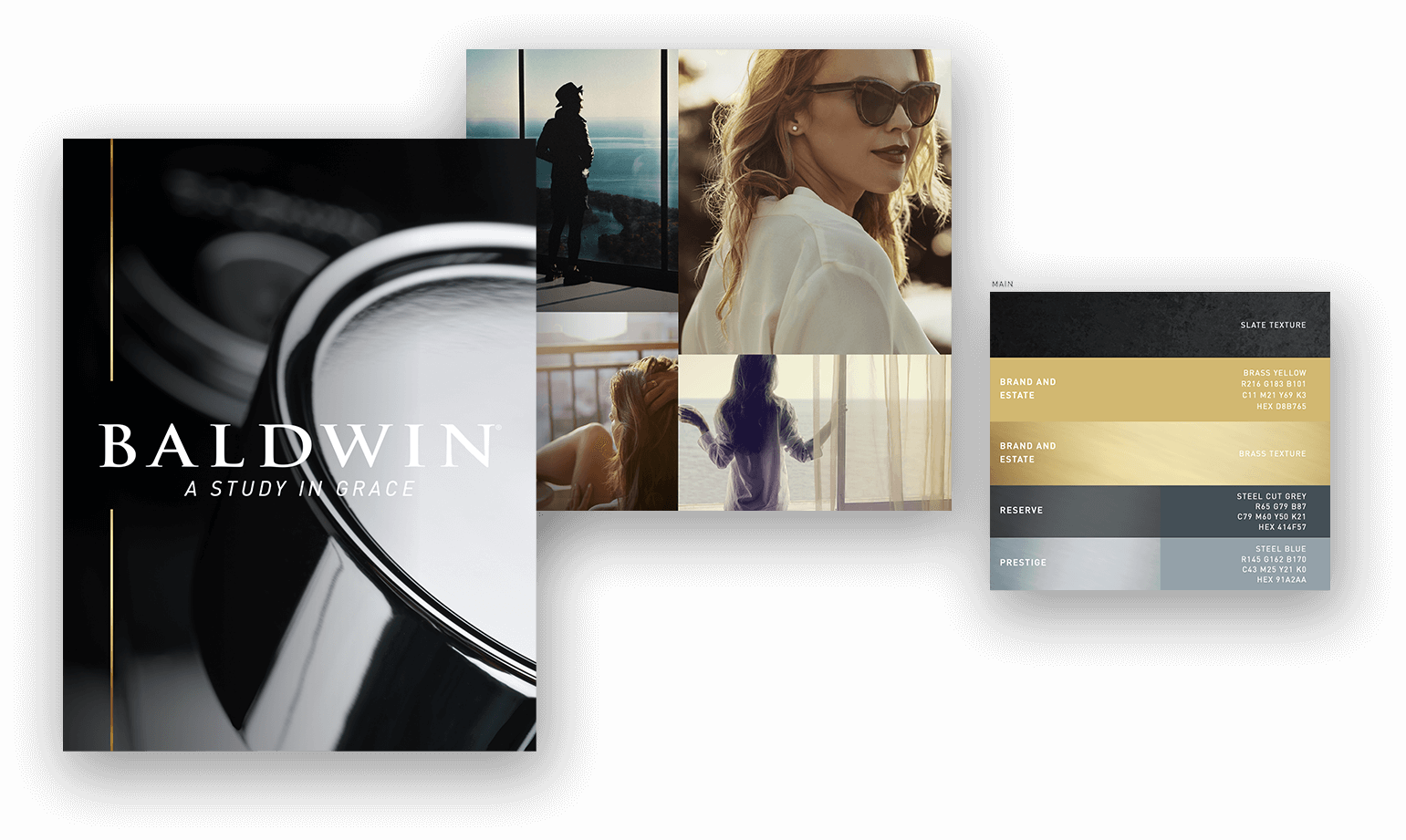
We created an intertwined brand hierarchy, where each sub-brand had their own specific way of talking to their own specific audience, all while relating back to the Baldwin Branded House through language and design features. The graphic approach was to borrow from the modern elegance and flair of contemporary fashion styling, while maintaining a core sense of heritage by using classic fonts in unique ways, and tapping into the textures and gradients that reflect some of the Baldwin products. Across each section of the Baldwin universe, the style changes in very simple but specific tones. Colors, font usage, photographic styling for lifestyle and product, all designed to communicate with their respective audiences, but straight from the heart of the brand so that no sub-brand stole essence from its sister sub-brands, or from the Master Baldwin Brand.
ASSETS FOR THE BRAND FUTURE
Internally, Baldwin has an incredibly strong design team that is tasked with carrying the Baldwin brand into the future through day to day communications. One of our biggest challenges to ourselves was to give the a strong foundation, but with the flexibility to develop fresh approaches season after season. The other goal was to ensure they had everything they needed to hit the ground running with an entirely new set of brand assets. From logo lock-ups, to consumer friendly positioning statements, to fonts, color spectrums and an entirely new library of lifestyle assets ready to communicate with those customers who expect the finest design, hand-crafted styling and cutting-edge innovation that the Baldwin brand provides.