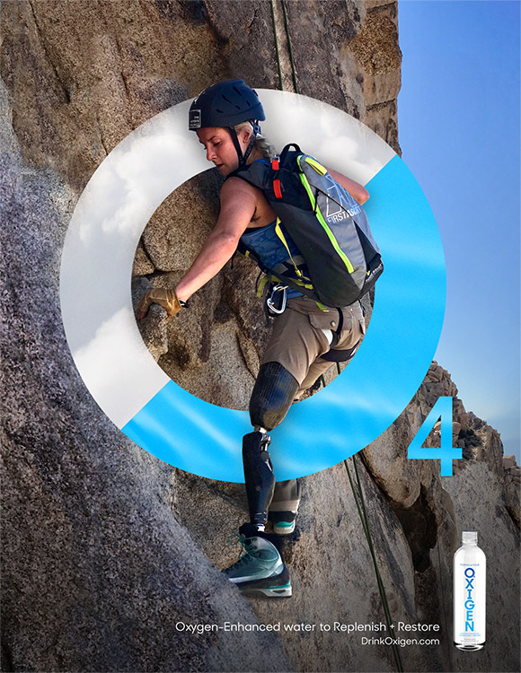
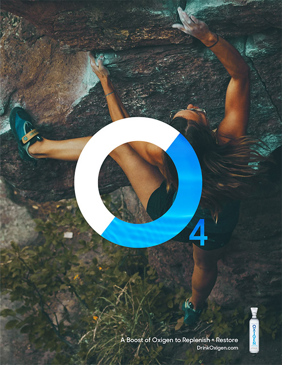
After analyzing the insights and learnings through primary research, we found that consumers were jaded and overwhelmed by all the claims in the category. But a little information goes a long way. Consumers want not only transferable proof behind the scientific claims, but also want the assurance of the water’s purity. When introduced to the natural benefits of the 04 molecule in Oxigen, with the restorative qualities oxygen offers the body’s system, consumers found the categorical differentiation compelling.
The Challenge —
How do you Break Through an Oversaturated Water Market?
So many health-conscious consumers are actively looking for water with “benefits,” not “just” water. But it’s hard for them to navigate the barrage of claims in the oversaturated battleground of the Functional Water Category. When we set out to overhaul the Oxigen brand, with its unique offering of oxygen-enhanced water, we needed to find a way to help Oxigen’s brand and benefits stand out from the highly competitive market.
Client
Oxigen
Project
Rebranding
Deliverables
Strategy, Media, Web Design, Social Channel Management, Social Content, Digital, Print, Packaging
Make It
Mean Some
thing
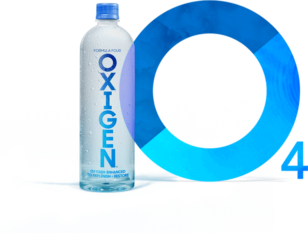
The idea of duality and balance is important to each of the products. Water and oxygen. Replenish and restore. Brain and body. Life in balance. By highlighting this duality, and making it key to the language, we found a way to build from the iconic nature of the 04 molecule and gave consumers the ability to “Hydrate with Purpose.”
Hydrate
with
Purpose
Science
Becomes
Icon
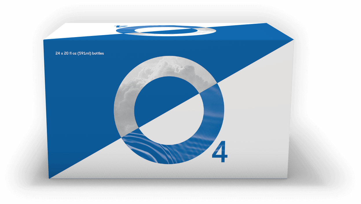
When overhauling the brand identity and ethos, we needed to find a way to keep the differentiation of the 04 molecule front and center across the individual products. By incorporating 04 into the new Oxigen logo, we ensured that the consumer understood there was an iconic and formulated difference. Layering the iconic 04 mark over split images presented the duality of water and oxygen or the restorative nature of the shots, all while maintaining a pure and natural look that communicates the ability to “Hydrate with Purpose.”
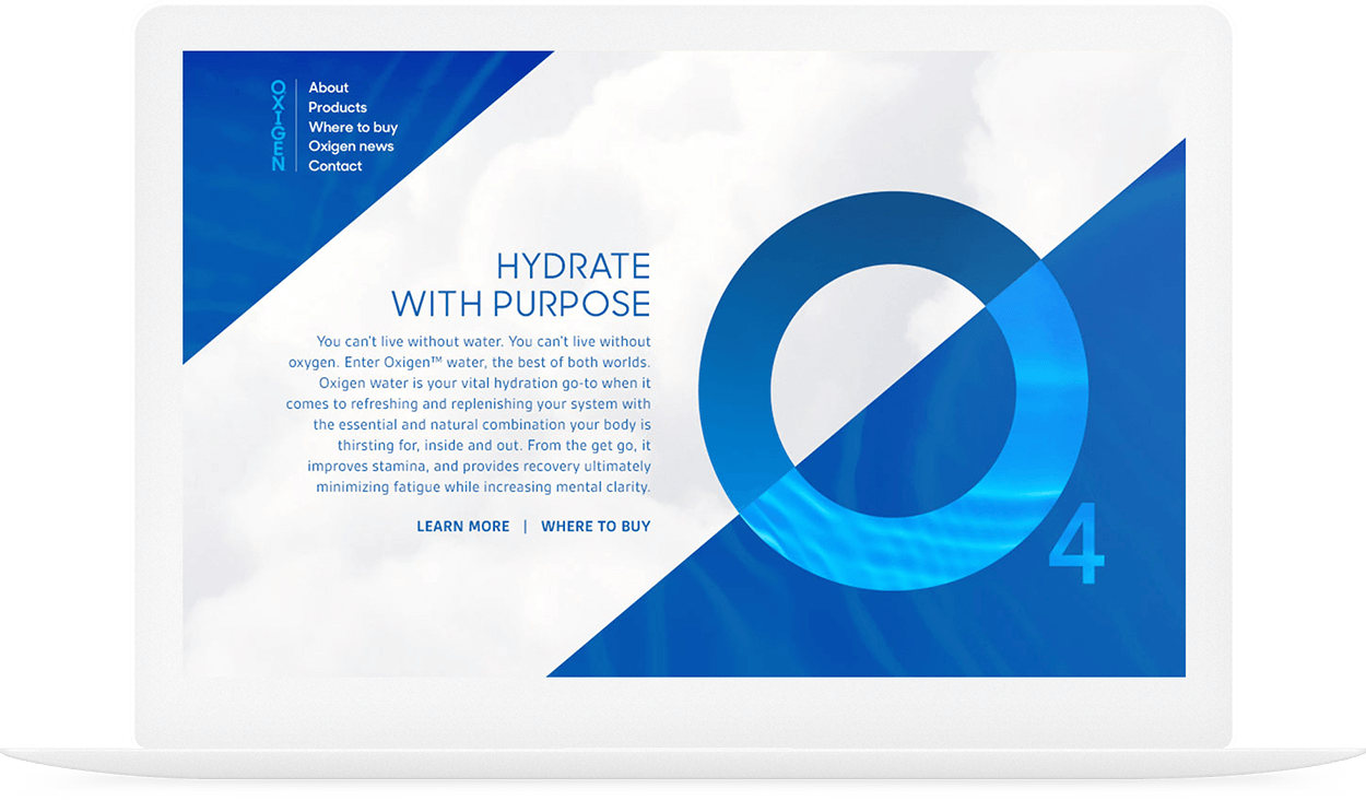
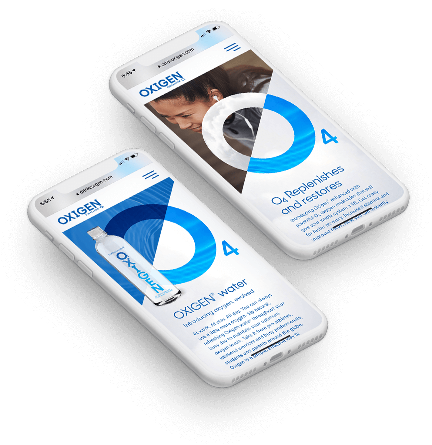
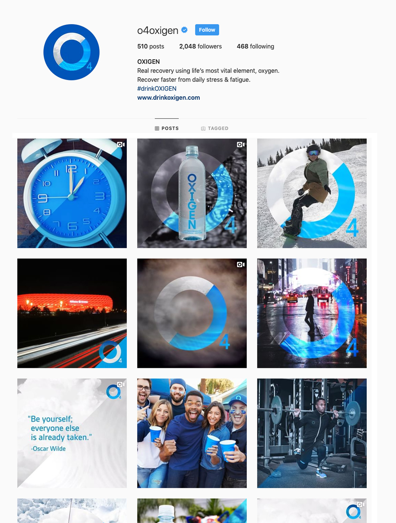
The iconic brand design and communication needed to work in a wide breadth of executions: one- and two-color offset printing, four-color packaging, flyers and sell sheets, outdoor, social media imagery and animation. The more we rolled the brand out, and the more we explored the dexterity of the brand language, the more it came alive and delivered on the brand promise.
A Brand
Comes
to Life
THE RESULTS
A Brand Replenished and Restored
The rollout of the revitalized brand was a tremendous success that included greater channel buy-in and distribution. Additional SKUs were added to the line, and most important, consumer consideration increased far beyond the prior brand levels.

